Q&A-Color & Consumers
Colors for Food Products: Logos and Packaging
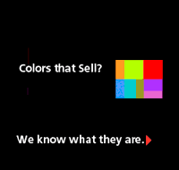
Colors for a Logo
Question:
I'm interested in colors which consumers are attracted to with relation to food. Basically, I would like to select colors for a logo to a new grocery store that I am contemplating opening. Any feedback??????
LKPete
Karl: Consumers (hey, that's us!) are attracted to different colors for different types of food, except for blue which is usually an indication that the substance is inedible. But are you after food colors or grocery store colors? If it's colors for the whole store, several things can determine your choices. First, as in real estate, is, Location, Location, Loation. Is this store on a side street of a big city? A strip mall along an avenue? At an interstate's offramp in the midst of a vast flat area? The color(s) and the size will change according to the anwer to this question. Second is location-related: what's around it? Other stores? Will you be the Mom 'n' Pop among the fast food franchises? Will it be next to a restored inner city train station or a train station in need of restoration. Or what? Third: what're ya selling. Okay, groceries, you said that, but does the word "gourmet" ever enter into it? Is there a consistency to your stock that might be indicated by your signage and stationary, etc. Next: do you want to convey the image of the old-fashioned, friendly neighborhood grocer or will you be employing surly adolescents in a flourescent-lit Quik-E-Mart convenience stop (Lottery tickets, no waiting). And, of course, there's the cost. Most signmakers will have affordable, off-the-rack colors and letterforms. If you want to go whole hog (you'll be selling meat, right?) you might consult with a graphic designer who can advise you on a whole graphic program and perhaps even decor that can reinforce the image you're trying to convey through the signage. You might start with dmcoy on this very bulletin board (at least as a source of more detailed info), as his postings have indicated that he is a graphic designer.
This email address is being protected from spambots. You need JavaScript enabled to view it.
Hey Karl, you left out some stuff. Are we talkin' produce, packaged goods, wholistic foods,etc.,etc. What feel are you going for? Cool/hip, old world, suburban mom, friendly neighborhood market,etc. Geography and demographics may help play a role in it, too. As for colors that appeal with food it may be based on personal preference. (My own favorites:deep crimson, rusty oranges/golds, and purple martin for food enticements) Gotta go, getting hungry. Let me know if you open this thing, love to see it. David.
Colors for food packaging
Question: I need help with colors for food packaging. I hear that I should avoid blue.
Reply:
Ron, true, blue is an appetite suppressant, although only in certain concentrations and by volume of use. But a color like Purple Martin used in a ratio of say 15-20% of total space with a dominant color such as Golden Wheat, add maybe a punch of Oriental Red (3-5%) and you've roused up the greatest of appetites. Reds, oranges, violets and rich greens in particular are all going to accentuate hunger. Increase the intensity using black. Most grocers have discovered that black highlights the quality and color of produce by making the background recede. (Shrinkwrapped packaging, produce build-ups, etc.) Best advice take a field trip to your local grocer. Keep in mind colors that attract the target consumer and demographics you are trying to reach. Young? Affluent? Gourmet?
Anon:
just saw your post and hope it's not too late. I'm away from my bookcase and can't give you the exact title of two or three key books about color use in various consumer products, but you might want to look at Thomas Hines' book The Total Package, which talks about color use in the packaging of just about everything. Probably just as useful as a trip to Barnes & Noble would be a trip to the supermarket. Most product categories stay pretty close to a specific color code. In general, the more intense and pure the color, the stronger the flavor (or whatever). Low-fat, sugar-free, skim and Lite versions of a product will be in paler, lighter tones. The milk carton code in the US is pretty much red for whole milk and blue for skim (low-fat is sometimes yellow, sometimes all-white). There are variations on this theme for almost every food group. These differ between the US and Europe and to some degree within different regions of the US. Housewife? Study which brands developed a loyal following in which markets. Good luck.

