Color Matters Blog
Blog 2008 -Part 1
Blog Archives 1: January - March 2008
When is a Color Hideous?
February 26, 2008
Yes, we all have strong feelings about color. When American Idol's Simon declared that contestant Chikezie's orange suit was hideous, I was shocked. I've never heard anyone declare a color "hideous" - and even more appalling, it was said in front of an audience of 29 million people. In the days that followed, I began to think about the larger issues: Why does a color work and why doesn't it work? Is it really all about personal reactions and color stereotypes - or is there more to it than meets the eye?

I'll admit that long before I became a color consultant, I was drawn to orange. It wasn't my favorite color, but I liked it so much that, many years ago, I owned an orange Toyota liftback - which prompted my good friend and mentor to comment that "orange was the one color that a car shouldn't be." My revenge: Today we see orange as the identifying color for the 2009 Hummer H3T and the Honda Fit. (See the landing page of the Hummer and Honda Fit web sites.) However, we might ask whether orange is being used as an attention-getting device in the visual bombardment of print, broadcast, and web media or part of a new wave of popular colors. This is a topic for another time.
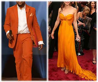
Last week (February 2008), when Idol contestant Chikezie's orange suit was labeled "hideous"- that got my color adrenaline flowing. Actually, when you compare Chikezie's orange suit (February 19) with Kelly Preston's orange Oscar gown (February 25), Chikezie pulled it off. Orange is one of many vibrant colors that look great on dark skin tones and overwhelm fair skin. In fact, whether you call the color of Kelly's gown "canary" or "marigold" or "yellow-orange." the color looks like acid and makes her look like she needs some fresh air and sunshine.
It's all relative. Maybe you could say that there's no such thing as a bad color. There are only bad color combinations. Skin, hair, and the color of what you wear - all of these combine to create the final effect. Another thing. What about that "Red Carpet" behind Kelly? Clash, clash, clash. What about the dark stage behind Chikezie? So now we can add the surrounding environment to the whole issue of color harmony. (Compare this to the Honda Fit and Hummer backgrounds).
In conclusion, the real context of the hideous nature of Chikezie's orange suit is the contest itself. A search for new young talent. The suit was NOT young. Robert Downey may be able to wear a hot pink dinner jacket but he's a generation removed from this scene.
All things considered, the overall color effect was stunning in isolation from the "Idol" contest, but yes, hideous in the context of wearing a two-piece orange suit in a youth-oriented forward-looking culture.
>

Reinventing Color
March 3, 2008

Whatever happened to color? A new show - "Color Chart: Reinventing Color" - opened at the Museum of Modern Art (MOMA) in New York. The philosophical basis for the show is the disappearance of the spiritual aspects and scientific properties of color and the emergence of color as a commercial product. . .True????
The quest for the anti-aesthetic in art overtook the quest for beauty in the first half of the 20th century (See the work of Duchamp and Warhol for examples.) That is old news. However, it's worth making a distinction about two kinds of art today: There is the world of "serious art" – art that is shown in prestigious museums, artwork that makes history. On the other side of the art scene today is the decorative world of lush landscape paintings and leaping dolphin sculptures. The MOMA exhibit focuses on the formal art historical category of images and objects.
As for color, you may have heard that "color is the most relative of all the ingredients in art." I've often asked what this really means. My best answer has been that we always see color in a context. A red flower against green leaves. As Josef Albers demonstrated, any color can look wildly different depending on its context. However, a commentary on the exhibit provided a fresh take on the "relative" nature of color. Consider this: Color can't be verified by our senses. Unlike materials (or mass or height, etc.), you can verify that a sculpture is steel by touching it. However, if you think a painting's greenness isn't really green, touching it won't confirm or deny its color.*
It's worth a few minutes (or more) to see the web site devoted to the exhibit.
See MOMA-"Color Chart: Reinventing Color
Also - Commentary from Newsweek
The Commercialization of Color
March 10, 2008

"You put color into products you make because . . . color sells." Sound familiar? Actually the full quote dates back to the 1948 Fuller Paint catalogue. As follows:
Color Engineering ups morale - makes production costs go down
You put color into products you make because your sales department knows that color sells. If your product can't be colored, you put it into a colorful package. If color can make your customers buy more, color can make your employees try more. It's the same basic emotional response. Color Engineering by Fuller proves it.
As follow-up to the previous post about the MOMA exhibit, this historical source is worth noting. While we take for granted the thousands of colors available by paint manufacturers today, the availability of commercial house paint (in perhaps only 50 colors) was an amazing milestone in the 1940s . . . and the technology to make colored products - as we know them today - didn't exist.
The psychology of the Fuller sales pitch is also quite interesting. Although dated, the same arguments are recycled today.
Here's a photo of some pages from the 1948 Fuller Paint catalogue:

Natural Color
March 16, 2008
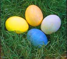
It's the time of the year when many people take part in the tradition of dying eggs for Easter. Most just buy a simple kit and dye away. Once again, this continues the recent theme in this blog about the commercialization of color. Of note: PAAS Dye Company started making commercial in the 1800s (not the 1900s) - but commercial dyes didn't gain mass popularity until after World War II.
As an alternative to commercial dyes, get in touch with natural color by using onion skins, beets, cabbage and even turmeric to dye your Easter eggs. This also gets to the historical roots of coloring Easter eggs. For example, early settlers in the U.S. would wrap eggs in onion skins to create a marbled effect on the shell.
It's a little more work, but not that much more. Plus it's a lot of fun. See How to make Natural Dyes.
More information:
About Easter
Why do we paint eggs on Easter?
Color Factoid: Red eggs are the brightest symbol of Greek Easter, representing the blood of Christ and rebirth. Read more: Red-Dyed Easter Eggs
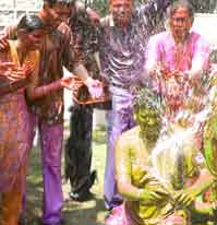
An Explosion of Dyes
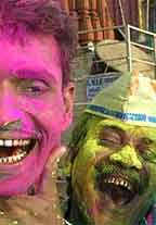
No, not Easter egg dyes. This is a wilder world of color - a celebration of Spring when Hindus in India throw, squirt and smear heaps of dry and wet colors on each other.
The Hindu celebration of Holi (also known as the Festival of Colors) is celebrated the day after the first full moon in March, For most, it's a time to shed inhibitions and be merry. Spring fun at its best. The colorful antics may also provide medicinal benefits. Many believe that the weather changes can cause viral fevers and colds. The colored powders were typically made of medicinal herbs - a tradition which continues in some parts of the world today.
Maybe the tradition of dyeing Easter eggs can be coupled with this Indian rite in the Western world next year.
Data-crunching Artists - The color of Info on the Web
March 31, 2008

Census data crunched into color
The MOMA exhibit "Color Chart: Reinventing Color" has inspired several articles on this blog. Now, the grand finale! The evolution and reinvention of color into color charts can be seen in a body of work designed by "data-crunching artists" who transform the world of information on the web (email, blog posts, videos, and reports) into mesmerizing digital images.
Of note, Jason Salavon crunched census data and crafted sinuous ribbons representing the population of every US county over the course of 200 years. (As illustrated above)
Leonardo Solaas project entitled "Dreamlines" is a web-based app that generates an ambiguous painting in perpetual change. Just enter a word or two and Solaas's program performs a Google Image search to compile a basic data set. The app reads the color value of each pixel from the retrieved photos to drive the direction of the particles in a seemingly endless swarm.
Is it art? Or is this genre of color charting an epithet for color and a symbol of the final victory of commercial color and color as a symbol of technology and cultural reality today?
A must-see:
"Frame That Spam! Data-Crunching Artists Transform the World of Information" Wired Magazine
New: A YouTube video of the Holi Color Explosion
(This is an award-winnning video from India about the post from last week. You will be surprised by the ending.)
When you subscribe to the blog, we will send you an e-mail when there are new updates on the site so you wouldn't miss them.

