• Color Symbolism

The Color of Medications


Taking the Color of Medications Seriously
 

pills and color
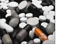
The earliest pill emerged in ancient Egypt as a little round ball containing medicinal ingredients mixed with clay or bread. For the next five thousand years - up until the middle of the 20th century - pills were round and white. Color was almost non-existent. “ Over the counter” medications were only available as tablets in ghostly white or pasty pastel hues; likewise prescription medications were colorless pills encased in clear or transparent orange vials. Liquids, with the exception of Pepto-Bismol’s pink, were drab as well.

It's a different world today, thanks to advances in technology. The color transformation started in the '60s and accelerated in 1975 when the new technology of “softgel” capsules made colorful medications possible for the first time. Shiny primary colors such as cherry red, lime green and tangy yellow arrived first. Today's gel caps can be tinted to any of 80,000 color combinations. As for tablets, continuous advancements in technology consistently bring new and colorful coating products to market.

On the other hand, does color really matter? Aside from the obvious fact that pills are more attractive to the eye, color has indeed benefited consumers as well as the pharmaceutical companies in several very functional ways.

colored pills 
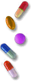
First of all, color helps the consumer distinguish the non-prescription or prescription medications from other tablets or capsules. As testimony to the serious nature of this issue, The New York Times called patients’ failure to take medications as prescribed the world's “other drug problem.”

This is especially relevant for the elderly who get confused when they take various medications, most of which are small white tablets. Consider the statistics: The US Senate's Aging and Youth Committee reported that the typical Medicare beneficiary uses an average of 18 to 24 prescriptions a year. (Source) Researchers have also found that patients who took more drugs on a daily basis preferred bright pill colors. Consequently, color and color combinations are a powerful way to create emotional appeal and reduce medical errors.

Consider another fact: Patients respond best when color corresponds with the intended results of the medication. For example, calm blue for a good night's sleep and dynamic red for speedy relief. Or consider a reverse scenario: fire red capsules for acid reflux or murky bile green for nausea.

A similar benefit is rooted in the synaesthetic effects of color - and specifically a color's associations with smell and taste. Even early civilizations such as the Romans recognized that people "eat with their eyes" as well as their palates. As proof, butter has been colored yellow as far back as the 1300s.

Although technically we don't “eat” pills, we do taste and swallow them. What would a grey pill taste and smell like? Smoky, fruity or moldy? How about a pink pill? Sour, bitter, or sweet? Which one would be easier to swallow? Furthermore, synaesthetic effects of colors also include associations with temperature. For example, a blue pill is cool, an orange pill, hot.


Color Consultation Healthcare and Pharmaceuticals


Aside from countless functional benefits for the consumer, color is now playing an even more powerful role in transforming the plain white pill into a unique, brand image. This has become even more significant due two recent events that have transformed marketing – and the role of color - in the pharmaceutical industry.

First, many medications – previously available only with a prescription - are now available as “over the counter” (OTC) products, without a prescription in the US. This means that customers are shopping for medications and making decisions in stores. In fact, recent research by the Henley Centre reports that 73% of purchasing decisions are now made in-store. Therefore, it's even more important for pharmaceutical products to catch shopper's eye and to convey information effectively. As competition heats up, color and design are critical to the brand. Consider the packaging and advertising for the new OTC, Celebrex: tranquil blue skies and the greener pastures of relief from suffering.

Second, five years ago, the Food and Drug Administration (U.S.) relaxed its restrictions on direct-to-consumer marketing of pharmaceuticals. As a result, broadcast and print advertising exploded. Just turn on your television and note which drugs are being marketed aggressively. “Ask your doctor about the purple pill….” And it's not limited to television. Print advertisements are predominantly purple and the product's web site is hosted at http://www.purplepill.com. (Note: US style DTC advertising is not permitted in the UK and Europe with the exception of a live broadcast, such as the Super Bowl, that includes pharmaceutical advertising.)

Consequently, drug companies are leaving nothing to chance. The color and shape of the pills, and the names and imagery used to sell products are heavily researched and tested, much like the drugs themselves.

Color has been elevated to a “powerhouse” status because it is the most fundamental part of a drug's personality. As is the case with all products – from computers to colas - purchasing decisions are not just based on what a product looks like (visual brand) but on the idea of the brand (its core brand value), how customers feel about it (emotional brand). In other words, color has the unique ability to do all three simultaneously – to create emotional appeal, to communicate functional values and benefits (such as reliable pain relief), and to distinguish the brand from others.

A significant example of the critical role colors play is the competition between two prescription medications for male virility: Viagra and Levitra.

Viagra, a diamond-shaped blue pill, was introduced in 1997. It immediately became an overnight sensation- one of the most successful prescription medications in the pharmaceutical history – with sales of the drug totaling $1.74 billion in one year alone. In 2002, the marketing groups of a rival product, Levitra, brainstormed the issue of color for their brand. The purpose was to figure out "how to beat the blues," referring to Viagra's sky-blue tablets.

Extensive market research concluded that consumers didn't "resonate with the imagery" of Viagra. They found that the blue color was too cool and was equated with being sick. The goal was to come up with an enticing color and logo for Levitra. After extensive testing, the team presented Levitra's color: orange, an extremely vibrant and energetic color. And the logo? An orange and purple flame.

In conclusion, color does indeed matter - 80% of visual information is related to color - and this is especially true for pharmaceutical products. Color is functional. Color subliminally and overtly communicates information and provides many other operational benefits.

On the other hand, color may not matter in the future of prescription medications tablets and capsules. Scientists have created a coin-sized microchip drug dispenser that may be implanted under the skin. It would be programmed to release medications in concentrated formulas -- all on different schedules. Sensors may even be attached to the chip to detect the level of a drug in your body and then add more as needed. Source: Science News

©Jill Morton, All rights reserved

Learn more :Color Psychology in Medicine, an article by Jill Morton /Color Matters for Munsell


Also from Color Matters

newsletter parrot subscribe
Stay in touch with the latest news about color.
Subscribe to the free bi-monthly newsletter.


sq PCS UH posterLearn how color affects the mind and body in "The Psychology of Color Symbolism".


SQ Foolproof Color logo brand 432
We just launched two new online courses about color for logos and branding. Learn how to empower your brand with color in two hours time or less. See "Color Psychology for Logos and Branding" and "Color Harmony for Logos and Branding"


Global Color Database

Gender Differences

The Meaning of Color for Gender

by Natalia Khouw
 

What we see and interact with is in color and this includes both natural and built environments. About 80% of the information which we assimilate through the sense, is visual. However, color does more than just give us objective information about our world-it affects how we feel. The presence of color become more important in interior environment, since most people spend more time inside than outside.


Is there a gender difference in response to color? Although findings are ambiguous, many investigations have indicated that there are differences between gender in preferences for colors. Early investigations done by by Guilford (1934) on the harmony of color combinations found that a person is likely to see balance in colors that are closely related or the opposite. Guilford also found some evidence that more pleasing results were obtained from either very small or very large differences in hue rather than medium differences, with this tendency more frequent in women than men.

A review of color studies done by Eysenck in early 1940's notes the following results to the relationship between gender and color. Dorcus (1926) found yellow had a higher affective value for the men than women and St. George (1938) maintained that blue for men stands out far more than for women. An even earlier study by Jastrow (1897) found men preferred blue to red and women red to blue. Eysenck's study, however, found only one gender difference with yellow being preferred to orange by women and orange to yellow by men. This finding was reinforced later by Birren (1952) who found men preferred orange to yellow; while women placed orange at the bottom of the list.

Guilford and Smith (1959) found men were generally more tolerant toward achromatic colors than women. Thus, Guilford and Smith proposed that women might be more color-concious and their color tastes more flexible and diverse. Likewise, McInnis and Shearer (1964) found that blue green was more favored among women than men, and women preferred tints more than shades. They also found 56% of men and 76% of women preferred cool colors, and 51% men and 45% women chose bright colors. In a similar study, Plater (1967) found men had a tendency to prefer stronger chromas than women.

Rikard Kuller (1976) conducted a study on the effects of color in two opposite environments. Six men and six women were asked to stay in two rooms, one room was colorful and complex; while the other was gray and sterile. Electroencephalogram (EEG) and pulse rates were recorded throughout the period, as well as the individuals' subjective emotional feelings. The results showed heart rates were faster in the gray room than in the colorful room. Moreover, men were found to have stress reactions more than women. Men also became more bored than did the women in the gray room. Kuller also postulated that men could not achieve the same degree of mental relaxation as women.

Thomas, Curtis, and Bolton (1978) interviewed 72 Nepalese and asked them to list the names all the colors they could think of. There was a significant difference between men and women. Although, the women consistently listed more color names than men did, the cultural context of this study must be noted since Nepalese women traditionally wear more colorful clothing than men do. A similar study by Greene (1995) examined the color identification and vocabulary skills of college students. They were asked to identify the colors of 21 color chips. The results showed that women recognized significantly more elaborate colors than did the men. Findings also indicated that gender different responses in color identification may be attributed to a difference in the socialization of men and women.

Another study examined the appropriateness of colors used on the walls of a simulated domestic interior furnished in one of three styles; Georgian, Art Nouveau and Modern. Whitfield (1984) reported that internal consistency among women is higher than for men. When the study was broadened to include marital status, married women achieve significantly more internal consistency in each condition of the three styles than did the men.

More recently, Radeloff (1990) has found that women were more likely than men to have a favorite color. In expressing the preferences for light versus dark colors, there was no significant differences between men and women; however, in expressing the preference for bright and soft colors, there was a difference, with women preferring soft colors and men preferring bright ones.


Data about color preferences of women - Colorcom


RESEARCH 

Gender and the Meaning of Color in Interior Environments

by Natalia Khouw

TESTING INSTRUMENT
The six abstract color palettes used in the Guerin, Park, and Yang (1995) model to test the meaning of color in interior environments were incorporated into a computer generated 3-D commercial lobby space. The computer-generated images in the six color palettes were reproduced into slides. Each slide illustrated the same furniture groupings with the following differences in the color palettes:

  • Interior 1 in cool hues, light value dominant, low chroma, and high contrast.
  • Interior 2 in warm hues, light value dominant, high chroma, and high contrast.
  • Interior 3 in warm hues, light value dominant, medium chroma, and low contrast.
  • Interior 4 in neutral hues, light value dominant, low chroma, and high contrast.
  • Interior 5 in cool hues, medium value dominant, high chroma, and medium contrast.
  • Interior 6 in warm hues, dark value dominant, medium chroma, and medium contrast.

A questionnaire was developed from the 21 words used by Guerin, Park, and Yang (1995) to describe the characteristics of interior environments. Subjects were asked to respond to each cescriptor with zero suggesting the characteristic was not present; and five that the characteristic was largely present. In other words, as the number increased, so did the degree of presence of the characteristic (see descriptor list below).

pleasant
calming
expensive
open
spacious
intricate
diverse
inviting
comfortable
modest
complex
ordered
airy
formal
exciting
attractive
sophisticated
coordinated
unified
casual
rich

ANALYSIS
The responses were separated into men and women categories and examined based on the responses to each descriptor. Three factors were found to emerge after a factor analysis was performed on the 21 decriptive words using Varimax rotation. Each factor was then assigned a name based on the underlying contruct that found to be in common within each set of adjective descriptors (see list below).

Livability Factor:
pleasant, comfortable, inviting, calming, airy, spacious, casual, open, modest, attractive.

Organization Factor:
ordered, unified, coordinated, formal, sophisticated, expensive, rich.

Symptomatic Factor:
exciting, diverse, complex, intricate.


 Hz ColorPsych spiral logo brand 550

Trustworthy color formulas for logos and branding
An eCourse from Jill Morton, Color Matters author & consultant.


IMPLICATIONS
This exploratory work reinforces evidence from other studies that have found color responses to be influenced by gender differences. Previous studies have shown men are relatively more tolerant to achromatic colors than women (Guilford & Smith, 1959). Meanwhile in this study found the percentages of men rated the color palettes with chromatic relationships higher than did women, especially the interiors with high chroma such as Interior 2 and Interior 5. It is postulated that, in general, men are more tolerant to the use of either achromatic or chromatic colors in interiors.

An examination of the results across all six interiors found only Interior 5 as having significantly different responses between the genders to the color relationships applied in the interior. With its cool hue, medium value dominant, high chroma, and medium contrast, Interior 5 was considered more favorable by men than women who felt there was too much contrast. Researches have shown that cool hues such as blue are seen as calming and relaxing, whereas warm hues such as red are seen as exciting and stimulating. With red and blue as the dominant colors in Interior 5, it suggested that the combination of this two extreme color characteristics creates confusion and distraction, with higher frequency of these reactions in women than men. Surprisingly, Walton and Morrison found that the combination of red and blue, on the contrary, were most preferred by adults (Birren, 1978).

As one contemplates the findings from a design viewpoint, a few suggestions can be made. It is clear that each color palette has its own characteristics, in terms of how the subjects responded to the three factors of Livability, Organization, and Symptomatic. The factors obtained for each interior are relevant to several different design applications. For example, the design of retail spaces such as clothing stores targeted to attract specific genders might wish to take into consideration the impact of color and color relationships in the store design. The results of this study suggest that the color palettes used in Interior 1 and Interior 3 would be the best match for attracting men into the store because the Livability factor and the Symptomatic factor is higher for men in those interiors than any other interiors.

Only six color treatments were tested in this study. Therefore, the study of additional color palettes will expand the range of choices and will provide a better understanding on gender and the color relationships in the interior environments.

This study also suggested that, regardless of gender, people are most sensitive to the chroma used in interior spaces. Subjects in this study tend to dislike the warm-colored environments that had high chroma and high contrast as in Interior 2, and medium chroma and medium contrast, as in Interior 6. Overall, the subjects in this study felt that warm-colored environments with medium and high chroma were generally unpleasant and overpowering; yet, both men and women agreed that the Organization factor and the Symptomatic factor were present in Interior 2 and Interior 6. On the other hand, another warm-colored environment, Interior 3 with medium chroma and low contrast, was listed as the most preffered interior and subjects considered it as appealing and calming. In addition, Interior 3 were rated as higher on the Livability factor and Symptomatic factor, but lower on the Organization factor; with on women responding more positively to the Livability factor, while men responding more positively to the Symptomatic factor.

Previous research has indicated that subjects perceived warm-colored environments as less attractive and less pleasant than cool-colored environments (Bellizzi & Crowley, 1983). However, according to the evidence gathered from this study, subjects in this study appeared to be more effected by the combination of color properties such as hue, value, and chroma, than by the coolness or wamth alone. In other words, the subject's impressions of color seemed to be more subtle and effected not just by the cooolness or warmness of the color palette, but also by the calibration of value, chroma, and contrast used in the interiors.

Further research on the relationship between gender and the meaning of color in the interior environment is suggested. Parallel interdiciplinary studies that examine aspects of culture, human psychology and physiology would provide a more complete understanding of gender color responses to color relationships and the meaning of color. This exploratory study has provide data that needs broadening in order to provide the design community with more information about the relationship of color and meaning in the design of interior spaces.

Learn the language of color

REFERENCES


Bellizzi, J. A. & Crowley, A. E. (1983). The effects of color in store design, Journal of Retailing, 59, 21-45.

Birren, F. (1952). Your Color and Yourself, Sandusky: Prang Company Publishers.

Birren, F. (1978). Color and Human Response, New York: Van Nostrand Reinhold Company.

Eysenck, H. J. (1941). A critical and exprimental study of color preferences. American Journal of Psychology, 54, 385-394.

Green, K. S. (1995). Blue versus periwinkle: Color identification and gender. Perceptual and Motor Skills, 80 (1), 21-32.

Guilford, J. P. (1934). The affective value of color as a function of hue, tint, and chroma. Journal of Experimental Psychology, June.

Guilford, J. P. & Smith, P. C. (1959). A system of color-preferences. The American Journal of Psychology, 73 (4), 487-502.

Guerin, D. A., Park, Y., & Yang, S. (1995). Development of an instrument to study the meaning of color in interior environments. Journal of Interior Design, 20 (2), 31-41.

Kuller, R. (1976). The Use of Space--Some Physiological and Philosophical Aspects. Paper presented at the Third International Architectural Psychology Conference, University Louis Pasteur, Strasbourg, France.

McInnis, J. H. & Shearer, J. K. (1964). Relationship between color choices and selected preferences for the individual. Journal of Home Economics, 56,181-187.

Plater, G. (1967). Adolescent preferences for fabric, color, and design on usual task. Unpublished master's thesis, Indiana State College, Terre Haute, Indiana.

Radeloff, D. J. (1990). Role of color in perception of attractiveness. Perceptual and Motor Skills, 71, 151-160.

Thomas, L. L., Curtis, A. T., & Bolton, R. (1978). Sex differences in elicited color lexicon size. Perceptual and Motor Skills, 47, 77-78.

Whitfield, A. (1984). Individual differences in evaluation of architectural colour: Categorization effects. Perceptual and Motor Skills, 59, 183-186.


You might also be interested in:

Does pink make strong men weak? What happens when you put angry prisoners in a pink jail cell? Discover the effects of pink on the body! 
Drunk Tank Pink
at Color Matters

Pink jail cell and prisoners


Global Color Database


The Magic & Mystery of Words


alt

We are six billion people living in a color-drenched world. In fact, there are one million colors that the human eye can distinguish. (Others put the number as high as 7 million.)

How we translate colors into language is a formidable and endless task. If we begin with a search for standard terms, we'll find Berlin and Kay’s linguistic study. It lists eleven basic color terms that fall into three classes:

Black, gray, white (achromatic color terms)
Red, green, blue, yellow (primary color terms)
Brown, orange, purple, pink (secondary color terms)

However, people obviously make many more subtle distinctions in color than merely these eleven cited by Berlin and Kay. Back in the 1930s - 40s, the British Colour Council published a Dictionary of Colour Standards that often had very strange names for colors, like Bee Eater Blue, Kermes, and Squirrel. Currently, the NBS/ISCC system defines a set of 267 color centroids with intuitive yet scientific standardized names (such as "light grayish red"). This sadly neglected system is as close as we’ll get to a standard for English color terms.

Other resources are Standard Color Terms by Berlin and Kay and The Visual Nature of Color by Patricia Sloane. (Although some reviewers disagree with the factual nature of some chapters, the book includes a long list of color names derived from objects and a reprint of the ISCC list of 267 major color classes.)

On the other hand, most people don’t use standard terms like "light yellowish brown" to describe "tan." A greater issue is how we might define popular descriptive terms that are less scientific.

For example, in our current world of non-standard terms, most people are familiar with colors described by words such as crimson, indigo, chartreuse and khaki. Some may have difficulty with puce (a purplish-brown), cerise (cherry red), viridian (green with a tinge of blue), ochre (dark yellow), and cyan (blue-green). Painters and designers may have an easy time with common pigment terms such as ultramarine, umber, sienna, quinacridone violet and phthalo blue. Others may choke.

Another problem is posed by similar yet distinctly different color terms, such as burgundy (a dark blue-based red) and maroon (a dark brown-based red). Others may debate turquoise and aqua, fuchsia and magenta. For example, the color swatches in PowerPoint might label aqua as something different from the aqua in the web-safe color chart. If we turn to the NBS system, we'll find "medium blue-green," "deep greenish blue," and many other similar hues. The rest is up to us.

Speaking of turquoise, this term and chartreuse are examples of several common English terms of French origin - that most people recognize - but very few can spell (and understandably so). Bizarre spellings also arise from fuchsia, a familiar term for "hot pink." Aside from sincere efforts to spell the term phonetically, including "fuschia,v the correct spelling - fuchsia - was derived from the name of a German botanist, Leonard Fuchs.

altGiven this state of affairs, over 140,000 people have taken the Global Color Survey at Color Matters. In the beginning, people could answer by entering any text as an answer to a question. (For example: Which color do you associate with "Good Luck"?) If a person considered green to be a lucky color, they could type "green" or "kelly green," or any description of the color. As we reviewed the answers to all the questions, we found 792 terms for green. Such as: snappy green, summer tree-tops green micro-green, kindergarten green, dookie green, cheap-ass 7-11 green, frog egg green, and peridot green. The best by far was "basement bathroom green."

Nicotine CreamOf note were the 1,000 plus terms used to define whites, off-whites, and beige. Adjectives such as glistening, pearly, shimmery, blinding, glittering, and gleaming were frequently coupled with white. More common terms, such as ivory, ecru, parchment, vanilla and cream, were used for off-whites and very light browns. Once again, some imaginative terms arose. "Time Card Beige" and "Nicotine Cream" won the awards in this area of the color wsheel.

Finally, there were quite a few terms (in the database) that pushed the limits of our minds, as well as several web search engines. We share them with you now.

Annatto = orange-yellow
(the rich golden color of cheddar cheese actually comes from the seeds of the annatto plant)

Eau-de-Nil = a light shade of green

Gamboge = brownish orange
(Asian yellow gum resin; reddish yellow color)

Peridot = pale green, a variety of olivine

Amaranth = a deep reddish purple to dark or grayish, purplish red
(amaranthine-unfading, eternal, purple)

Anthracite = coal black

Cochineal = red

Note:
Most definitions were found at Tiscali Reference - A Dictionary of Difficult Words
The best reference for Universal Color Terms: Universal Color Language, Level 3


Color Logic for Design

Color & Culture Matters

 The symbolism and the history of green are great examples of how the messages and meanings of any color varies and evolves over time.

Giovani Arnolfini and His Bride by Jan van Eyck


Giovanni Arnolfini and His Bride

by Jan Van Eyck , 1434

The bride in this Renaissance masterpiece wears green as a symbol of her fertility. She is slouching in imitation of pregnancy, thus indicating her willingness to bear children.


fig leaf and green candy bar


The Evolution of the Symbolism of Green in Western culture


In Celtic myths the Green man was the God of fertility.

Later in the millennium, Early Christians banned green because it had been used in pagan ceremonies.

Nevertheless, as evidenced by Van Eyck's 15th Century wedding portrait, the color green was the best choice for the bride's gown because of its earliest symbolism.

Of note is the continued symbolism attached to the color in the latter part of this century. Anyone who chooses a green m & m (an American candy which contains an assortment of different colored chocolate sweets) is sending a somewhat similar message. Green has been reinterpreted by late 20th century American culture to signify a state of heightened sexuality in this specific situation.

Green brides and green m&ms
 
Other bride colors:

White would not be an appropriate color for a wedding in China. It is the color of mourning. If a bride chooses a white wedding gown, her parents would probably not allow her to get married.

In India, even in Christian weddings, while most brides wear white, it is usually relieved by at least a touch of some other color. If a married woman wears unrelieved white in India, she is inviting widowhood and unhappiness.

 Colors for what you wear

fig leaf and green candy bar


Other cultural references for green:

  • Green was a sacred color to the Egyptians representing the hope and joy of Spring.
  • Green is a sacred color to Muslims.
  • Japanese Emperor Hirohito's birthday is celebrated as "Green Day" because he loved to garden.


Green trivia:

  • It is said that green is the most restful color for the human eye.
  • Some claim that green has great healing power an that it can soothe pain.
  • Suicides dropped 34% when London's Blackfriar Bridge was painted green.


fig leaf and green candy bar

Universal symbolism:
Nature, freshness

Contemporary symbolism:
Ecologically beneficial

The Meanings of Green

Green-man-fertility
More about the pagan "Green Man"
Does a green ease absent-mindedness?
  The Meanings of Colors: Green at Color Matters

fig leaf and green candy bar
 
A Guide to Color Symbolism

 
You might also be interested in:
 
 Pink Jail and Prisoners
What happens when you put angry prisoners in a pink jail cell?
Discover the effects of pink on the body! Drunk Tank Pink at Color Matters

 The Psychology of Color Symbolism - online training

Color Matters eBook - Get a copy of this web site to use at your convenience. Subscribe to the free Color Matters Newsletter


Color Matters is a registered trademark of J.L. Morton.
Graphics and Text: Copyright (c) 1995-2024, J.L.Morton, All rights reserved

copyscape banner blue 200x25Do not copy.

Powered by KLM Graphics