Is Black a Color? Is White a Color?
The answer to the question - "Are black and white colors?" - is one of the most debated issues about color. Ask a scientist and you'll get a reply based on physics: “Black is not a color, white is a color.” Ask an artist or a child with crayons and you'll get another: “Black is a color, white is not a color.” (Maybe!)
There are four sections on this page that present the best answers.
Introduction: How Colors Exist
# 1 - The First Answer: Color Theory #1 - Color as Light
Black is not a color. White is a color.
# 2 - The Second Answer: Color Theory #2 - Color as Pigment or Molecular Coloring Agents
Black is a color. White is not a color
# 3 - The Third and Most Complete Answer: Vision and Reflection
Comments from color pros: More about black & white
Introduction
How Colors Exist
A basic understanding of how colors are created is the first step in providing correct answers. Here are two examples:
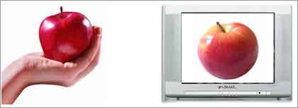
The color of a tangible object is the result of pigments or molecular coloring agents. For example, the color of a red apple (in the illustration at the left) is the result of molecular coloring agents on the surface of the apple. Also, a painting of a red apple is the result of red pigments used to create the image.
The colors of objects viewed on a television set or on a computer monitor are the result of colored light (in the illustration at the right). If you're not familiar with how colors are created by light, look at your monitor or television screen close up. Put your eye right up against the screen. A small magnifying glass might help. This is what you will see:
A simplified way to explain it is that the color of a red apple on a computer or television is created by photons of red light that are transmitted within the electronic system.
Primary Colors
It's also important to understand the concept of "primary" colors. The fundamental rule is that there are three colors that cannot be made by mixing other colors together. These three, red, blue, and yellow, are known as the primary colors.
Now that we've described two different categories of colors (pigment and light-generated) and have a definition of primary colors, the answer to whether black and white are colors can be answered.
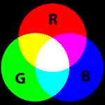
Color Theory 1 - Color as Light
(Additive Color Theory)
Red, Green, and Blue
(The primary colors of light)
The question:
Are black and white colors when generated as light?

Black and white cats generated on a television.
These colors are created by light.
The answers:
1. Black is the absence of color (and is therefore not a color)
Explanation:
When there is no light, everything is black. Test this out by going into a photographic dark room. There are no photons of light. In other words, there are no photons of colors.
2. White is the blending of all colors and is a color.
Explanation:
Light appears colorless or white. Sunlight is white light that is composed of all the colors of the spectrum. A rainbow is proof. You can't see the colors of sunlight except when atmospheric conditions bend the light rays and create a rainbow. You can also use a prism to demonstrate this.
Fact: The sum of all the colors of light add up to white. This is additive color theory.

Black = predator & danger. That's the symbolism of the color that some say isn't a color. Learn more about the purest symbolism of colors in this online course - Organic Color Symbolism - from Color Matters.

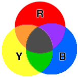
Color Theory 2 - Color as Pigment or Molecular Coloring Agents
(Subtractive Color Theory)
|
|
|
Red, Yellow, and Blue
(The primary colors of pigments in the art world) |
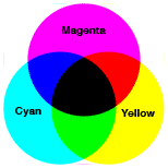
Cyan, Magenta, and Yellow
(The primary colors of inks in the printing industry) * |
The question:
Are black and white colors when they exist as pigments or as molecular coloring agents?
 Black and white cats created by colored crayons.
This is color generated by pigments.

Black and white cats. The colors of the fur is the result of molecules.
The answers:
1. Black is a color. (Chemists will confirm this!)
Explanation:
Here's a simple way to show how black is made: Combine all three primary colors (red yellow and blue) using a liquid paint or you even food coloring. You won't get a jet black, but the point will be clear. The history of black pigments includes charcoal, iron metals, and other chemicals as the source of black paints.
Resource: History of Pigments
Therefore, if someone argues that black is the absence of color, you can reply, “What is in a tube of black paint?” However, you must add the fact that black is a color when you are referring to the color of pigments and the coloring agents of tangible objects.
2. White is not a color.
... but .... in some cases you could say that white is a color.
The grey area:
Technically, pure white is the absence of color. In other words, you can't mix colors to create white. Therefore, white is the absence of color in the strictest sense of the definition.
However, when you examine the pigment chemistry of white, ground-up substances (such as chalk and bone) or chemicals (such as titanium and zinc) are used to create the many nuances of white in paint, chalk, crayons - and even products such as Noxema. It's worth noting that white paper is made by bleaching tree bark (paper pulp). Therefore, you could say that white is a color in the context of pigment chemistry.
More Information about CMYK primary colors:
In theory, mixing equal amounts of three primary colors should produce shades of grey or black when all three are fully saturated. In the print industry, cyan, magenta and yellow tend to produce muddy brown colors. For this reason, a fourth "primary" pigment, black, is often used in addition to the cyan, magenta, and yellow colors.

Learn the language of color online
DIY - Learn at your own pace.
Vision and Reflection
The final answer to whether black and white are colors takes other factors into consideration.
Colors exist in the larger context of human vision. Consider the fact that there are three parts to the process of the perception of color.
1. The medium - The color as it exists as a pigment/colorant (such as the color of a tangible object) or as light (such as the color of an image on a television screen).
2. The sender - How the color is transmitted.
3. The receiver - How humans see color. In other words, how we receive information about color.
(If a tree falls in the forest and there is nobody around does it make a sound? Does a color exist if there is no one to see it?)
The question:
Are black and white colors?
The answer:
The best answer combines both of the theories described in Part 1 and Part 2. Pigments and coloring agents (as described in Part 1) are only half of the answer.
Here's how we see color:
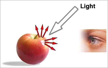
The color of a tangible object originates as a molecular coloring agent on the surface of the apple. We see the color of an object because that object reflects “a color” to the eye. Every color is the effect of a specific wavelength. Link to ElecroMagnetic Color at Color Matters.
In the case of the apple, we see the color red because the red apple reflects the specific wavelength of red (640nm is red).
The same theory applies to black and white.
The question:
Are black and white colors?
The answer:
1. Black is not a color; a black object absorbs all the colors of the visible spectrum and reflects none of them to the eyes.
The grey area about black:
- A black object may look black, but, technically, it may still be reflecting some light. For example, a black pigment results from a combination of several pigments that collectively absorb most colors. If appropriate proportions of three primary pigments are mixed, the result reflects so little light as to be called "black." In reality, what appears to be black may be reflecting some light.
- In physics, a black body is a perfect absorber of light.
2. White is a color. White reflects all the colors of the visible light spectrum to the eyes.
In conclusion
The colors we see are simply a degree of how much of this color present in light is reflected. To be completely accurate, a color reflects the wavelengths in the NM range that our retinal cones respond to.
The medium is the process of reflection of the wavelength of the color.
The receiver is our eyes which receive the wavelength of the color.
More from Color Matters

There's more to color than black and white! When you're finished with this article, discover the 3 most important things about color at Color Matters. See Basic Color Theory

When you're finished with black & white, explore some real colors at Color Matters: The Meanings of Color
Comments from colors pros: More about black & white
More about color vision:How the Eye Sees Color

Stay in touch with the latest news from Color Matters.
Subscribe to the free bi-monthly newsletter.


Download in minutes. Get a copy of the Color Matters web site to use at your convenience. Click
here.


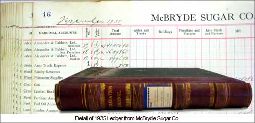
 Interviews with current and former residents provided valuable information. Retired workers- and especially those who had lived in the housing 50 years (or more) ago - told their stories about the plantation homes. A sampling: