• Color & Design

Color & Usability Matters


From small electronic objects to large airports, color plays a powerful role in helping you use a tool or navigate a space. Unfortunately, color is only beginning to gain recognition as a critical component in "usability." The following information presents a few of the many ways color can succeed or fail.


Color Coding and Wayfinding

Think about the last time you were in a train station or airport. How easy was it to find your way?  If you didn't speak English (or the native language), were there recognizable symbols to guide you?

The usability of a transportation center depends on how easily travelers can find a departure gate, a baggage claim area, phones, food and other necessities. Unfortunately, the directional signs in most airports fail miserably - especially those in the USA. By contrast, Shiphol Airport in Amsterdam is extremely successful. Bright yellow signs capture the attention of even the most weary traveler. Icons communicate where languages fail. The image below demonstrates how highly visible the yellow sign is. Notice that it has to compete with wide expanses of window and the strong natural light surrounding it.

Shiphol Airport signs-Amsterdam


Detail

Shiphol Airport signs detail

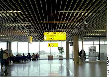
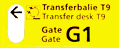
Color is the critical factor in the success of the visibility and readability of these signs.


Color Coding on Appliances

The smaller the object, the more difficult it is to find the right way to use the device. Buttons, buttons everywhere. Which one for what?


electronic devices with buttons everywhere

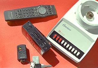
A TV remote control, a radio, a car alarm and a food blender (minus the top). Each of these objects relies on a wide variety of button controls. Each device has a control panel. The issue is human interface design.


Appliance Example: A Food Blender

Let's take a closer look at the object at the far right. It's the base of a food blender (as illustrated on the next page).

blender

If you're not familiar with this machine, a blender can chop onions, whip cream, grind bread into bread crumbs, make milkshakes and crush ice. At the base of the container are sharp blades which rotate at extremely fast speeds. Controlling the speed controls the consistency of the finished product.

When we take a closer look at the food blender "control panel" in the photograph below.

blender buttons

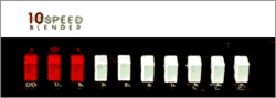
There are three red buttons and seven white buttons. Why are there three red buttons? Are there three critical functions? The three red buttons definitely stand out from the rest. This certainly indicates that there's something more important for these three buttons than the other buttons.

Pause for a moment and ask what's the most important thing that you need to control in this appliance. Imagine that you've filled the blender with peanuts. You want to chop them into small pieces for cookies. You don't want them to turn to powder and you don't want peanut butter. Also, consider the fact that a hand can fit inside the container. Frequently you remove the lid and add things to the mixture as the blades are rotating. Think about it. The most critical function is.....................OFF.

You have to be able to turn the machine off - for safety. You need to stop the machine when the appropriate amount of chopping, whipping or mixing has been achieved. Do the three red buttons mean that this blender has three off buttons?

Let's zoom in and see what these red buttons are for.

Details of blender buttons

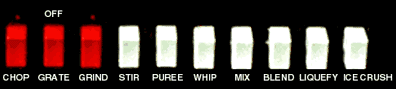
The red is used for three of the slower speeds and the off button. Confusing? How would you redesign this?


 encyclopedia for color design
Color theories
that the pros use


Appliance Example: A Credit Card Machine

What about a credit card machine with "Yes" and "No" buttons?
This machine is used at check out stands in stores.
After entering your credit card, you are prompted to verify if the total is correct. Yes or No.


credit card machine

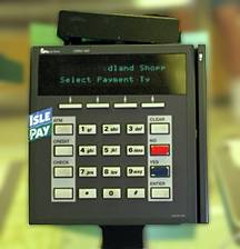
The total purchase amount is almost always correct in 99% of all transactions, a customer will want to press the "YES" button. Nevertheless, customers falter and fail to find the"YES" button. You can easily see why in the image above. Obviously, the red button catches the eye - but this red button is the" NO" button.Pressing "No" means that the amount is wrong.

Let's take a closer look at the colors used on the buttons. First , you can argue a case for using red as an emergency color that symbolizes "stop." If this were a machine involved human safety, a red "NO"(stop) button would be a good color choice. If this machine were used in situations that required "NO" (stop) as often as "YES" (go), it would be suitable. But this machine rarely requires "NO" - that the process be stopped. By comparison, the "YES" button is a dark color that doesn't grab your attention and is completely lost in a sea of bland buttons. The entire "interface" of this machine is a color communication failure.


Web UI Design


 Functional Color: A Trash Can

Consider for a moment the importance of the mundane trash receptacle. In some situations it should be highly visible to prevent littering. In other situations, such as a garden park, it shouldn't interfere with the natural landscape. The same considerations for usability apply. The examples below are from Amsterdam, The Netherlands.


trash cantrash can


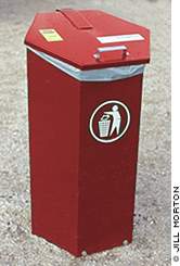
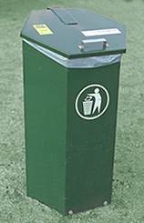
Notice the well designed symbols which successfully communicate the intended usage. Not all trash cans are this sensitive to international communication. A case in point is the icon used for a trash can on computers. Metal trash cans with a lid are not used in every country in the world.

computer trash can

This points to another usability issue. In the world of computers, it's known as user-interface design. From the visual interface of the operating system to the software components and peripherals, colors and symbols help you find your way and get the job done. In the same way that color works in an international airport, color combined with shapes and symbols will mean the difference between successful computer-human interaction or confusion.


 A message from Color Matters

 
Hz Foolproof Color Logo Brand blue 550
 
We just launched two new online courses about color for branding. Learn how to choose the best colors for usability and psychological effects. See "Color Psychology for Logos and Branding" and "Color Harmony for Logos and Branding"
 
 
Also, a downloadabe eBook from Color Matters
 
Take control of color


True Color: Metamerism


Colored t-shirts

Color is not only the most plastic of all design elements, it is also the most chameleon-like. Nothing can be more frustrating than discovering that the color of your newly installed carpet doesn't match the walls, or that the glaze on your newly fired pottery is not ox-blood red, or that the colors of your web site are not what they are supposed to be on your client’s computer.

First of all, potters expect and frequently delight in color mutations. The very act of submitting wares to a trial by fire (at temperatures that frequently exceed 2100 degrees Fahrenheit/1150 degrees Celsius) is a surrender of complete control. Those who use gas kilns and raku processes frequently marvel at the results. In many eastern cultures, this process is associated with other values and spiritual beliefs.

On the other hand, web sites and carpets represent substantial investments of money and time and exist in the today’s fast-paced world. Our sanity demands at least a semblance of control or a logic for the things we can’t control.


True Web Color

Some people say that as long as the grass is green and the sky is blue, Grandma and little Billy don’t give a hoot about the colors they see on the web. That may very well be true for some, but when a corporate logo turns out green instead of teal, when a t-shirt is returned because it's not tomato red, the attitude is quite different. Web color mutations can be explained by understanding what it takes to create accurate color.

The pivotal player in true web color goes by the name of "profile." Computer color profiles specifically define how your computer sees color - or what color profiles are embedded in a graphic. In other words, it describes the color vision of a computer and/or the color vocabulary in a graphic. If I wanted you to see the specific colors (a banana yellow on a medium chocolate brown) in this graphic ....

alt
 

The first thing I would do is EMBED a color profile into the graphic file. This profile would define the specific shade of yellow and brown that I have used in my graphic software in my computer. Now we have two players, you and your computer’s color profile and my graphic's color profile. All that is needed is the messenger to deliver them. The web browser must be able to carry these profiles to you. Unfortunately it's not that easy.  In spite of the fact that most designers have color management systems on their machines - and  in spite of the fact that graphic software such as Photoshop can embed color profiles in web graphics, the web visitor’s profile is still an unknown and all bets are off.

Web designers must begin  by designing all web graphics on computers that generate the best colors (as a result of fully corrected gamma and other standards). You can test your computer’s color vision at  Is Your Computer Color Blind? Once this is in place, use the PNG file format to embed the most accurate color  information from your end.

There are other complex and costly solutions. For example, if customers are truly dedicated to an online store, they might take the time to download  software for color accuracy at that site or to obtain hard copy of color swatches - but these are not realistic for most situations.

Find out more about computer color at Computer Color Matters


encyclopedia of color

True Product Color - Lighting

Consider the following scenario:

After months of shopping for carpet for the new office, you’ve finally selected a subtle beige, a warm tan, not quite camel, not honey, but a very nice quiet tan tone that will coordinate nicely with the wooden tones of the office furniture. A week later, as the carpet is being installed, you’re shocked to see a pasty gray hue on the floor.


tans


Welcome to the world of metamerism!

Metamerism is a phenomenon that occurs when colors change when viewed in different light sources. In the case of the carpet, the flooring was displayed in a showroom lit by warm incandescent lighting and installed in an office with cool fluorescent lighting. This cooler lighting is famous for sucking the life out of beige.

These surprises can be prevented by examining interior products under the same lighting of the intended space or by obtaining samples and viewing them in the lighting conditions of the space. The time of the day (morning, noon, late afternoon), the direction of natural light (north, south, etc.) as well as weather and seasonal conditions (overcast, rainy, sunny, winter, summer) also affect color. Reflected light from large colored surfaces such as walls and ceilings may also cause color mutations. When selecting paint, color surprises can be avoided by applying brush-outs to large areas on walls. This is the only way to truly preview interior and exterior paint colors.


True Product Color - Materials and Dyes

Taking the phenomenon of metamerism to a more complicated level, consider the following shopping experience:

You’re shopping at your favorite sporting goods store and find a pair of shorts in a great shade of bluish gray. While you’re wandering around, you find a shirt in same shade and hat to match. What a find! But wait ... outside the shorts, shirt and hat are not at all the same color! The shorts and shirt are made of the same material, manufactured by the same factory, and dyed by the same dye-house using the same colorants and additives. The hat is made from different materials, at different facilities, with a different choice of colorants and a different colorant process.


color mutations - blues


Welcome again to the world of metamerism!

In this situation, metamerism is a more complicated phenomenon that occurs when colored objects match in one light source but not in another. Several factors compound this problem, including colorant class, coloration processes, and color-matching between manufacturers.

Metamerism is almost inevitable with some colors and less of a problem with others. The colors that are most likely to have metameric problems include taupe, mauve, lilac, tan, celadon, gray/blues, and grays.

See the full article, Color Matching in a Retail Environment by Ian Barclay, Director of Color Operations for Colortec/Dyeables.


Foolproof color formulas for interior design

Universal Color Standards - Munsell


Munsell is a system which numerically describes 300 colors.

It encompasses the 3 dimensions of a color:

1. Hue - the color (such as red)

2. Value - the lightness or darkness of the color (coded numerically, the higher the number the lighter the color/ the lower, the darker)

3. Chroma - the dullness or purity of a color (coded numerically, the higher the number the purer the color / the lower the number, the more dulled or greyed). Most artists in the U.S.A. refer to this characteristic as "saturation". Sometimes, the terms saturation and chroma are used interchangeably. When scientists analyze the color of light, saturation and chroma are not the same.

In the scientific study described in Color & Energy Matters the Munsell System was used to designate a specific range of the colors that created the effect.

The following illustration is a screen capture of the Munsell color palette in from a graphic application.

Munsell

This information is for educational purposes only and does not represent an endorsement of any commercial product. Other systems include the Pantone, Toyo and Trumatch for graphic design, and the C.I.E. system for international standardization of color.

For more information see Modern color models


expert witness legal

Color Systems - RGB & CMYK

RGB or CMYK?

The color systems used by scientists and artists are entirely different. An artist will mix blue and yellow paint to get a shade of green; a scientist will mix green and red light to create yellow. The printed page in a magazine is yet another system.

It's important to define the two different kinds of color that we see in the world as the first step in understanding color systems. First, there's the color you can touch, such as the skin of an apple or a painted wall. These colors are part of the surface of an object. Next, there's the color you can't touch, such as a beam of red light and the colors produced by your computer monitor. Colors generated by light are part of one color system. The tangible colors which are on the surface of objects or on the printed page are another color system.

The following illustrations and descriptions define the different color systems.


Additive Color System
Red - Green - Blue (RGB)

RGB diagram

Scientists recognize the light primaries of red, green and blue. When combined, red and green light rays produce yellow, blue and green produce cyan, red and blue produce magenta. Red, green and blue mix to create white (light). Link to How the Eye Sees Color  for more information on the "additive" definition of light.

This color model is used in computer monitors, television sets, and theater. If you put your eye up against your television screen you might something like the illustration below.

Red, green and blue dots of light are creating the image. Where red and green overlap, you'll see yellow.

This system applies only to devices employing light, such as computer monitors and television sets.


Subtractive Color System
Red - Yellow - Blue

secondary colors
Primary Colors
Secondary Colors
Tertiary Colors

Most artists recognize red, yellow and blue as the 3 basic primary colors. These primaries are the pure colors which can not be created by mixing any other colors. Secondary hues are the result of mixing any of the two primaries. Tertiary colors result from mixing the secondary hues.

In subtractive color theory, all colors mix to yield black. Link to "How the Eye Sees Color" for more information about why this color system is subtractive.


The CMYK Color System
Cyan - Magenta - Yellow - Black

In the print industry, cyan, magenta, yellow and black are used as the primary colors. When you mix all the colors, the result is gray. If you look at a printed page with a magnifying glass you might see something like the illustration below.


Color Symbolism

Explore another dimension of color at the Color Matters website.
Visit Color Symbolism.


Color Matters eBook - Get a copy of this web site to use at your convenience. Subscribe to the free Color Matters Newsletter


Color Matters is a registered trademark of J.L. Morton.
Graphics and Text: Copyright (c) 1995-2024, J.L.Morton, All rights reserved

copyscape banner blue 200x25Do not copy.

Powered by KLM Graphics